Facebook Friends analysis… So many options!
A Facebook plugin called Find Your Best Friend On FB has blown up this week.
I assume that it looks at private messaging frequency and frequncy of likes and comments and then pops out a photo of you with that person.
I don’t really like these apps because they’re scanning your private messages and that makes me nervous. I did install it, run it, and then remove it though. It did seem to be accurate.
But there are a ton of other fun ways to visualize and analyze your Facebook network.
The first one is from Wolfram Alpha which has a plug in that does a lot of analysis and visualization, although no “best friends.”
Instead it has social insiders (shares the most friends) and social connectors (bridges between groups (like my twin sister is a bridge between my family group and my schoolmates group).
You can also see what friends like your stuff the most and comments on your stuff the most. That was really interesting to me.
NameGenWeb is my favorite app for this but it is down right now.
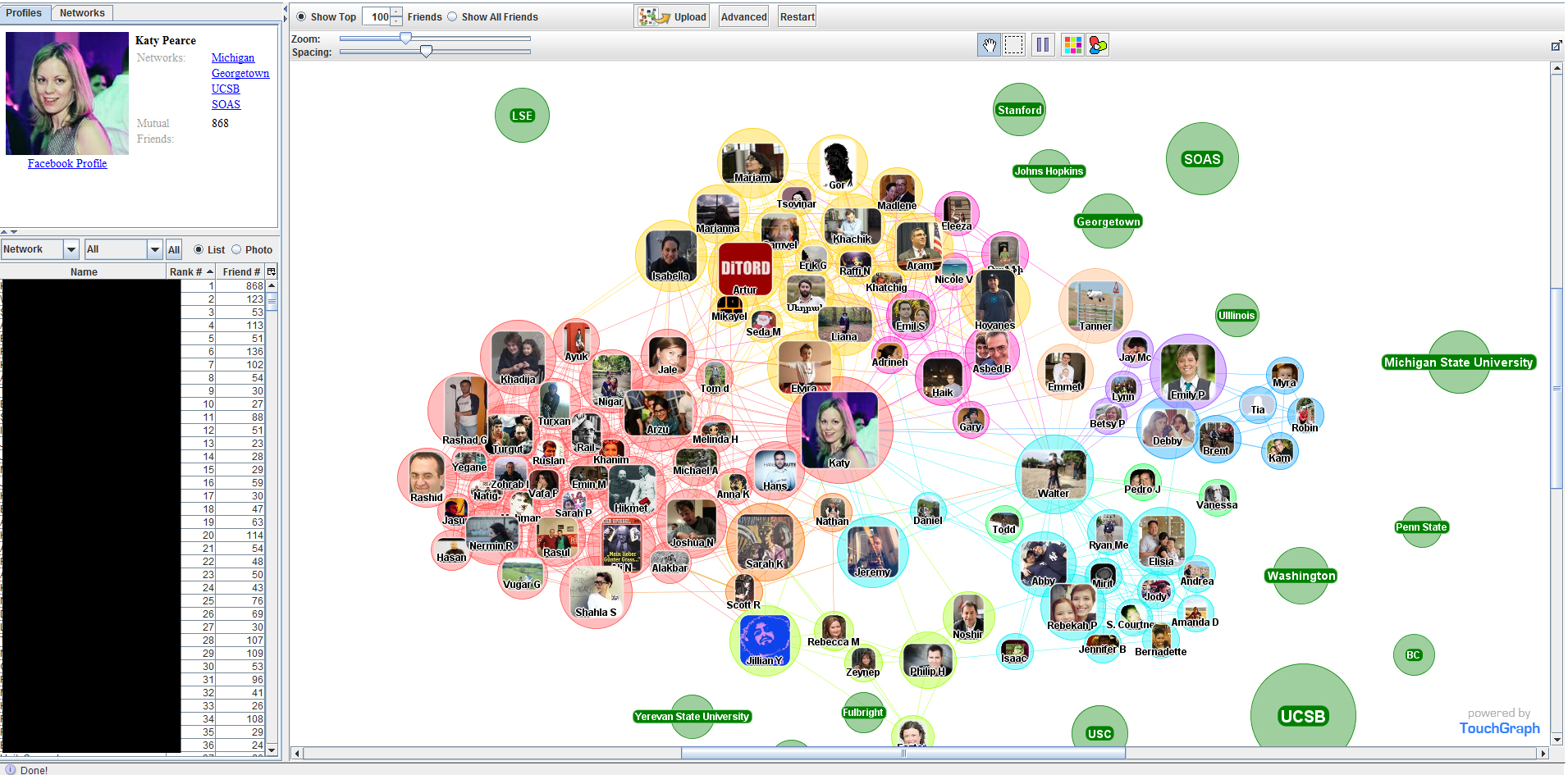
TouchGraph is pretty good too and is fast and mostly focuses on the networks that people have put themselves in (usually university networks). It ranks your friends (on number of friends in common). This wasn’t very accurate for me because it looks at those university networks more strongly than other factors. So, for example, a lot of people I grew up with attended Michigan State University in the late 1990s. I also have a number of friends who I did not grow up with who went there for their PhDs in the mid-late 2000s. That doesn’t mean much in terms of the connections between these groups.

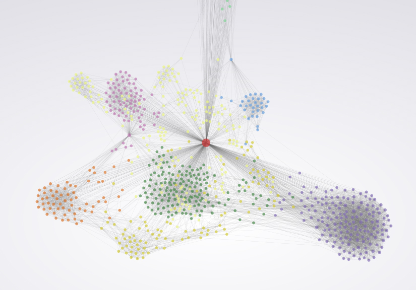
FriendsGraph is an interesting one but the visualizations are pretty boring.
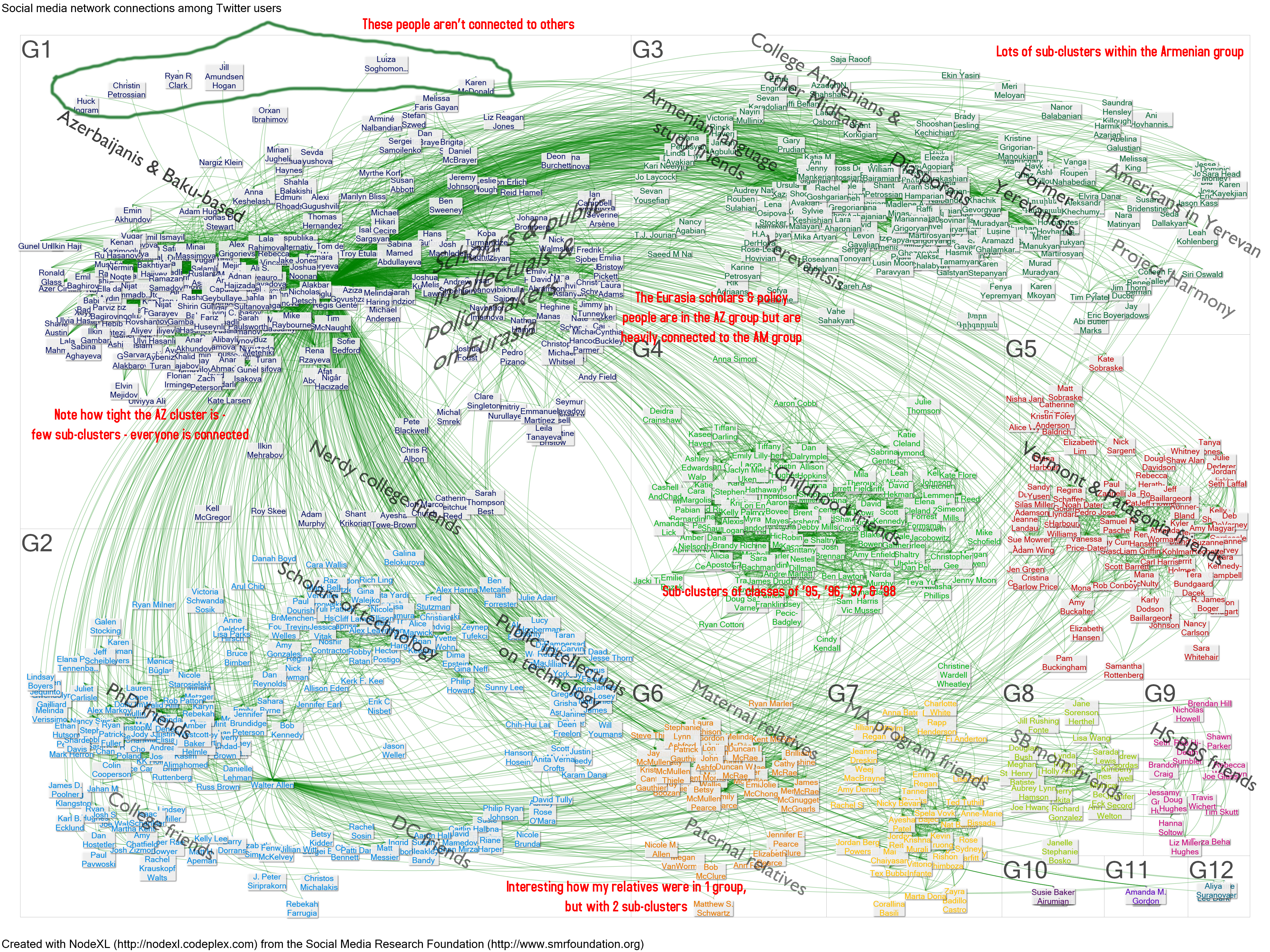
I like to use NodeXL and its Social Media Importer, but using it requires you to download some programs, so this is not a quick click. But the analysis is much more detailed (I added the labels to this picture).


